Role: Brand Concept Development
Team: 3 designers, 2 animators
Team: 3 designers, 2 animators
Challenge
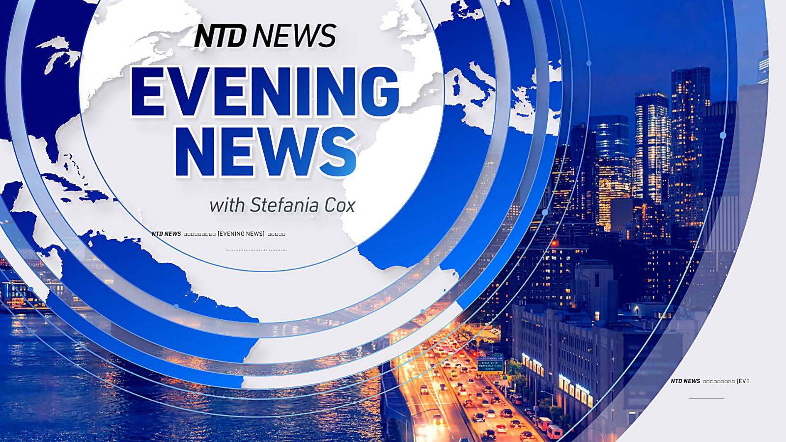
NTD is a global news channel. The brand needed a refreshed identity that could function across news programs, segments, and international distribution.
The logo had to be simple, strong, and adaptable for broadcast.
My first approach was based on three circles — reflecting the three core words behind the brand positioning. Conceptually it worked, but in motion it became repetitive. Every animation started to feel like the same loop.
The problem became clear:
How do you create a symbol that holds conceptual meaning but also opens space for dynamic broadcast use?


Strategic Shift
Instead of keeping the circles complete, I removed sections.
By cutting part of the circle, the form gained tension. It stopped being static and became directional.
The cut introduced movement.
That small structural change transformed the identity from a closed symbol into an open system.


Visual Approach
The partial circle allowed multiple animation behaviors:
• Rotation that reveals information
• Expansion into frames and segments
• Transition devices between programs
• Layered compositions for headlines and intros
The shape became more than a logo. It became a motion language.
It could fragment, align, rotate, and assemble — supporting different news categories without losing coherence.
The goal wasn’t decoration.
It was flexibility.
It was flexibility.